Painting 101: How to Choose White Paint
One of the things we get asked over and over is how to choose white paint. It sounds easy, because white is white, right? But if you look at “white” paints on Benjamin Moore’s website, you get 157 results. One hundred fifty seven slightly different shades of white!!! It’s overwhelming and intimidating … and, let’s be honest here, kind of ridiculous (I mean, seriously, 157???). So choosing white takes a little more work and a little more patience and a little more crossing your fingers and going for it.
So far, we’ve painted every room in our house the same color — Sherwin Williams “Snowbound” — which is a bright white with a subtle grey undertone. Our wood floors are red oak, so we needed to balance that redness with a cool/grey white. But the walls don’t look grey at all. I actually think they look like a creamy pure white, especially in the living room/kitchen, because the reddish floors and natural light balances out.
Because it was hard enough to choose ONE shade of white to go on the walls, the last thing I wanted to do was pick a SECOND one to use as trim. So I decided to use the same color! On the walls I used Snowbound in an eggshell finish, which gives a soft, velvety look with no shine, and on the trim I did the same shade of white in a semi-gloss finish. I chose eggshell because I wanted a lot of contrast between the walls and trim, and I personally prefer it over a flat finish. The walls and trim complement each other perfectly but don’t look exactly the same because of the different finishes. Our painter thought I was CRAZY when I told him my plan, but when it was done he loved it!
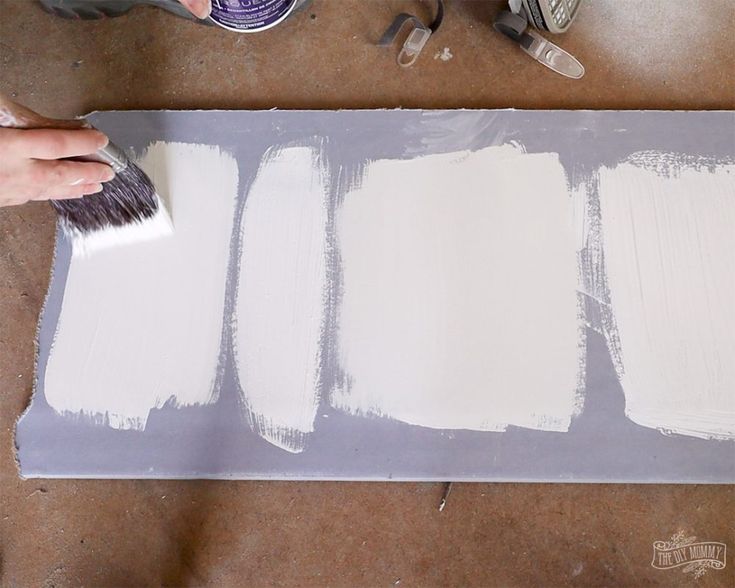
(On their own each of these paint chips is WHITE. Comparing them to each other brings out their undertones.)
So where do you start…
Look at undertones — White paints are all about undertone. There’s no such thing as an absolutely pure white paint, so every shade will have more or less subtle undertones of blue, yellow, pink, green, grey, that will change depending on the lighting in your space and other factors like floor color. So what may look pink in the store, could look pure white in your house.
Pick a mood — depending on your style and what look you’re going for, choose a warmer or cooler shade of white. A blue undertone will lead to a crisp, bright white, while a yellow undertone gives a soft, comfortable white. In our old house, we painted our office a creamy, warm white (Valspar “swiss coffee”), because that room got a ton of natural light and we didn’t want it to feel really sterile. Again, once it was on the wall, it just looked pure white.
Sample sample sample! — I can’t emphasize enough the importance of getting samples. Our process is always to pick up tons of paint chips, even shades that you might not like at the store, because they’ll definitely look different when you get home. Tape all the paint chips up in the room you want to paint. Move the chips around to different walls. Look at them at different times of day with the lights on and off and with the curtains opened and closed. Look at them with your floors, your furniture, your artwork and how they work with other rooms in your house (so if you can see your kitchen from your living room, you want to make sure the colors don’t clash).
My favorite paint-picking game is to tape all the chips up, step way back and choose a favorite or two. Then I have Andy look at them and pick his favorite. Then I move the chips around, put them in a different order on a different wall and ask him again. Once we are picking the same one(s) each time, then we buy a paint sample (or two).
Paint a BIG swatch of that sample up on a couple of walls (or on a big piece of posterboard/scrap wood if you don’t want to mess up your walls yet). Live with the sample for a few days so you can see it in different lighting conditions before you commit. I can’t tell you how many times we’ve fallen in love with a paint chip only to find it looked totally different when we actually painted it on the wall. The only way to really know is to get that sample! And they’re cheap, so just do it, ok?
When NOT to paint a room white — I love white walls, but not every room looks good in white. Rooms that don’t get much natural light can often look much better in a color. White needs light to reflect, and in a dark room, it may end up looking dingy and dull, which is NEVER what you want. We’re planning on painting our family room aqua blue instead of white for this exact reason.
My #1 Most Important Tip (for any paint color) — Don’t Stress About It! Ok, easier said than done, I know … BUT, just remember it’s only paint. If you hate it, you can change it!! I know a lot of people get so worried about making the wrong choice that they end up making no choice. They get paralyzed and leave everything the way it is. If you make a mistake, no big deal, it’s only paint! Try another color and move on with your life! Deal?
(Looking for more painting tips? Check out our best practices and recommended supplies!)
Sorry, the comment form is closed at this time.